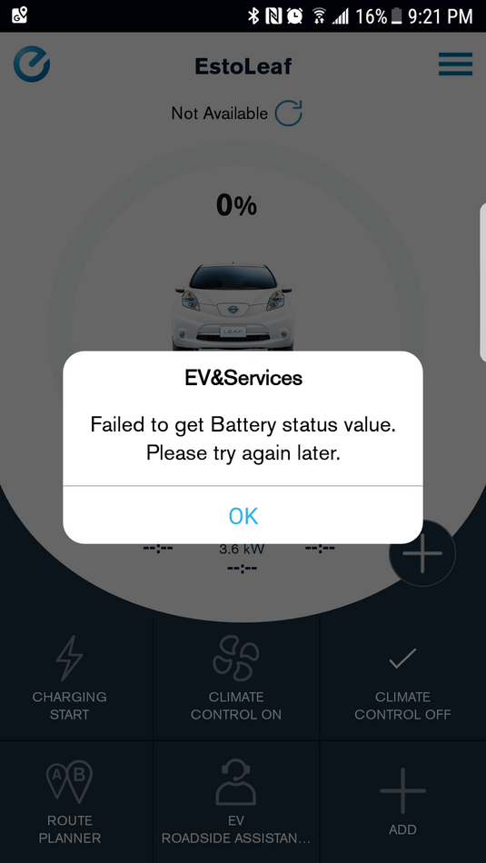
If it ain't broke why fix it? The new design don't care for it at all. I'm currently charging my car and it says 110% plugged in and had some mileage range digital only, versus the segmented bars and digits, like you would see on your dash and the old app.
Also every time you go to the charge function it automatically sends out a charge request; you don't even get a chance to ya or nay it. So it turned my charging off since it was already charging and did not indicate it. It's not really clear if you're charging or not anymore. It finally updated and states "charg...." (charging is cut it off in a stylized circular layout). Before they had two simple icons, one Plugged In, One charging now (both showing) with charge bars and range, in rectangular layout, using the full screen of smartphones (verses stuffing it on edge of graphics) so nothing is abbreviated. You don't get that same Info at a glance layout anymore. Booooo. One star.
I'm sure they made some other improvements that are better, but the basic General status page is more stylized and less useful. It looks like the people who programmed this App didn't actually drive an EV car or use the old app daily, as I do. Really the old version (basic functions) were better. Maybe they historical data, history page, your "ranking" part is better? Could care less.
I want to be able to see at a glance exactly what my range is, and is the charge cable plugged in and ready to charge, start and stop charging, turn on or turn off the environmental control system. That is not as clear now. Also the one button starts charging or stops charging without confirmation is just not really acceptable.