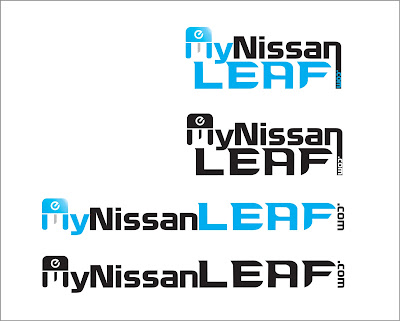
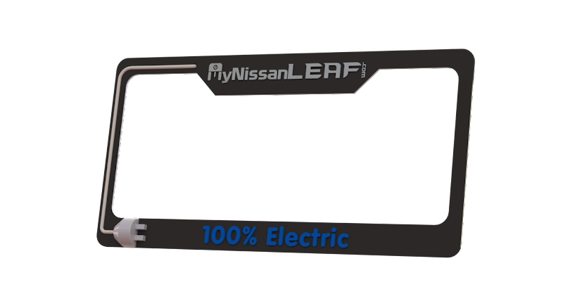
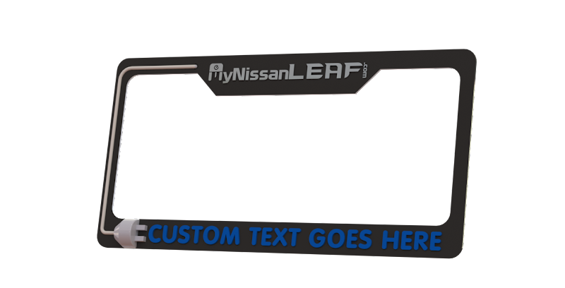
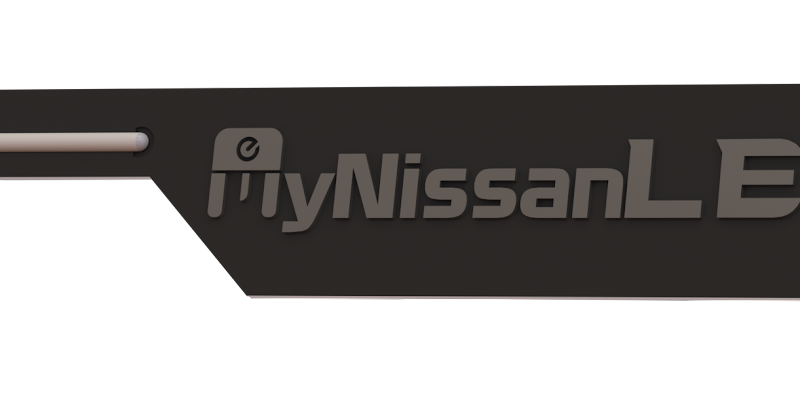
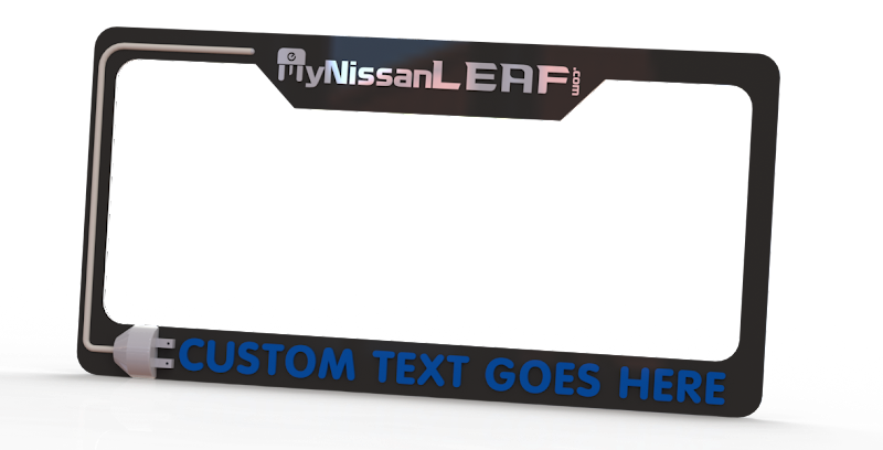
It seems to me that this solution may be trying to do too much. The "e" in the m, the fancy font, the 3-D plug, the (possibly) two colors, the tiny ".com" - seem excessive for a license plate frame. There's a saying, "60 at 60," which means "it should look good from 60 feet at 60 mile per hour." The nuances of this design not only will be lost unless the vehicle is parked, but may actually cloud the message. It might look nice on something stationary, like a coffee mug or a picture frame, but I think a simpler design, including the crisp, easy-to-read font currently used for MyNissanLeaf, would be preferable for a license frame.
BTW, how much will these custom, limited quantity, 3-D frames cost?
I don't mean to denigrate your efforts, Ronny, so I hope you'll take this as nothing more than one person's (hopefully) constructive criticism.
Glenn